Data Types
A data type defines the structure of a data element in a model. In different notations, data types are attached to different constructs:
-
For workflows, in BPMN, data types define the structure of data objects (and data inputs/oututs), activity inputs and outputs, messages and signals.
-
For decisions, in DMN, data types define the structure of data inputs, the interface of invokable (decision service and business knowledge models) and the output of decisions.
-
For cases, in CMMN, data types define the structure of case file items.
-
For Knowledge Entity models, data types define the structure of terms.
-
In Share Data models, data types are first class citizen and can be assigned to Data Items
FEEL Data Types
Trisotech uses FEEL data types from the DMN standard across its modeling and automation suite to define the data structure.
A data type can be of a simple type, a structure of types or a collection of types.
Simple Data Types
Text |
An ordered sequence of Unicode characters. |
Number |
A numeric value. There is no difference between integer and floating point, a single type represents both. |
Boolean |
A true or false value. |
Days and time duration |
A duration expressed using a number of days, hours, minutes and seconds. |
Years and months duration |
A duration expressed using years and months. |
Date and time |
A date and time value that can be expressed using an optional offset from the Universal Coordinated Time (UTC). |
Date |
A date value. |
Time |
A time value. |
File |
A structured data type that represents unstructured data as a file. The file data type has the following attributes: name, extension, created, modified, size, type, author, url. Note that this is not a FEEL defined type. |
Folder |
A structured data type that represents unstructured data as a folder. Available only in Case Modeler. The folder data type has the following attributes: name, created, author, files, folders. Note that this is not a FEEL defined type. |
Any |
Represents any structured data type in an abstract manner. |
Collection of Text |
Collection of text items. |
Collection of Number |
Collection of number items. |
Collection of Boolean |
Collection of boolean items. |
Collection of Days and time duration |
Collection of days and time duration items. |
Collection of Years and months duration |
Collection of years and months items. |
Collection of Date and time |
Collection of date and time items. |
Collection of Date |
Collection of date items. |
Collection of Time |
Collection of time items. |
Collection of File |
Collection of file items. Note that this is not a FEEL defined type. |
Managing Data Types
Data types in a model are centrally managed in a dialog accessible in the notation ribbon under an action called Data Type.

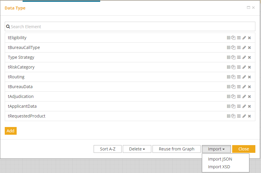
Each data type is listed in the Data Types dialog with some actions available on each of them.
Create collection |
Create a collection of the data type. |
Duplicate |
Create a copy of the data type. |
Details |
Display the details of the data type. |
Edit |
Edit the data type. |
Delete |
Delete the data type. |
Globally, there are actions that can be performed on data types.
Add |
Create a new data type. |
Sort A-Z |
Sort the data type list alphabetically. |
Delete |
Delete all or unused data types:
|
Reuse from Graph |
Reuse a data type from another model using the Digital Enterprise Graph. |
Import XSD |
Import one or more data types from XML XSD schemas. It is possible to import from multiple XSDs that import each other. Note that not all constraints expressed in an XSD can be mapped to data types. If some data types already exist in the model, we can replace or keep them. If we want to keep the data types that are in conflict, we must press the No button when the confirmation message appears and the import will continue. This action is undoable. |
Import JSON |
Import one or more data types from a JSON Schema. Note that not all constraints expressed in a JSON Schema can be mapped to data types. If some data types already exist in the model, we can replace or keep them. If we want to keep the data types that are in conflict, we must press the No button when the confirmation message appears and the import will continue. This action is undoable. |
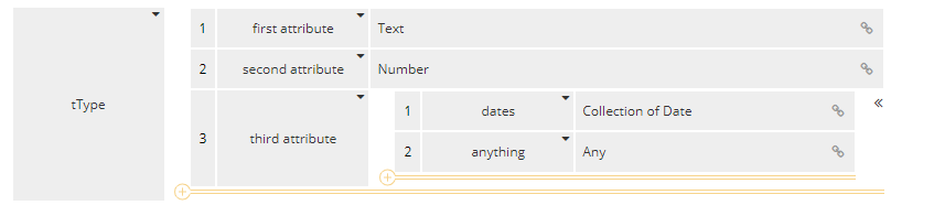
Defining a Data Type
When adding a new data type or editing an existing one, the dialog presents its structure and that structure can be edited.
To change the data type of a type or one of its attributes, clicking on the icon will offer different sources for the type.
Simple type |
Select from one of the simple types. |
Collection of |
Select a collection of any type. |
Range of |
Select a range of simple types. |
Existing Type |
Display a window with the data types that are already used by this model. This list can be searched. |
Structure |
Create a new data structure inline. |
Reuse from graph |
Select a data type already defined in another model from the Digital Enterprise Graph. |
Reuse from accelerator |
Select a data type already defined in an accelerator. |
To add a new attribute to a structure, press the icon at the end of the last attribute.
Data types details can be expanded ( ) or collapsed ( ).
Attributes can be reordered using drag and drop.
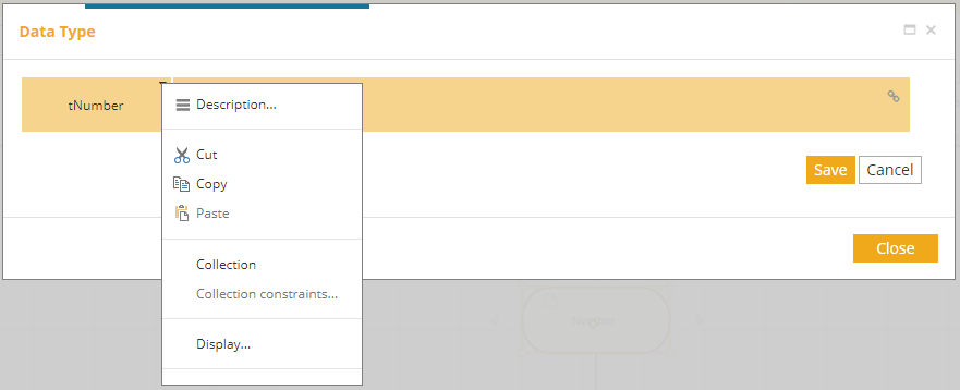
Right-clicking on an attribute (or using the icon) brings up a contextual menu with localized actions.
Description |
Enter a description for the data type or structure attribute. |
Insert Row Above |
Insert a new attribute row above the current row in a structure. |
Insert Row Below |
Insert a new attribute row below the current row in a structure. |
Delete Row |
Delete the current row in a structure. |
Cut |
Cut the current data type or structure attribute. |
Copy |
Copy the current data type or structure attribute. |
Paste |
Paste a data type. |
Collection |
Toggle the collection attribute of a data type or structure attribute. This displays the collection marker under the label of the data type or structure attribute ( ). |
Protected |
Toggle the protected attribute of a data type or structure attribute. This displays the shield marker on the left of the data type or structure name attribute ( ). Values of protected structure or field will not be shared with untrusted external endpoints. When a data type or structure attribute is protected, all its children are also protected. |
Refactor as a type |
Transfor an inline-defined structure as a data type that can also be reused by other data types. |
Protected Data Types
Data types can represent sensitive data such as social security number, account numbers, patient details etc. Such information should be protected especially when being sent out to other systems.
Most important aspect of data protection in Digital Enterprise Suite is focused on exposing that data to outside. Whenever data is source of information to be sent out
-
via service task based by operation from Operation Library
-
via send task or message throw/end events backed by Events Library
it’s going to be run via data protection layer that might obfuscate data before being sent out.
| Data protection does not interfere within automation services e.g. decision validation, internal processing within the process or case model. |
Protection can be applied on the whole type or individual fields of the type. Whenever the protection layer obfuscates the value it replaces it with [protected]. Only exception to this rule is when the actual value is null then there is no replacement.
Since [protected] is of type string it might cause data validation errors when using Always as data validation option.
|
Data protection applies to various components that are responsible for sending or publishing data outside of the platform. That includes
-
service operation (Operation Library)
-
events (Events Library)
-
emitters (Asynchronous events)
It also applies to service api that might return obfuscated data. It depends on the security context of the user who called the api. All interactions from within UI of the platform (service form) are considered trusted.
In order to obtain unprotected data, API call with token requires the Client App to be marked as trusted. This is done in the Administration product of the suite, under Client Apps section.
Data protection allows to mark certain systems (external urls) as trusted and by that allow to send protected data without being obfuscated. That can be configured and managed in Administration product, under Trusted endpoints section.
Adding constraints
Clicking on the type label of a data type or structure attribute (Text, Number, …) or "Constraints…" in the contextual menu of the data type, a dialog displays the constraints of that type.
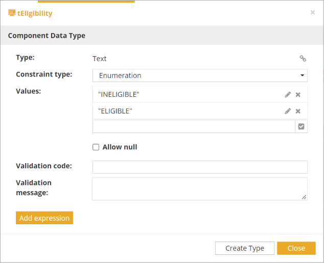
The following type of constraints are available
Range |
Number, Durations and Date/Time data types support entering a range of values. |
Expression |
A FEEL expression that defines the constraint on the type. |
Enumeration |
Most data type allows to enter an enumeration of allowed values for this data type. |
Not null |
The data type can never be set to null. Allowed on most data type. |
| For textual enumerations, you can paste multiple lines at once from a text file or even Microsoft Excel. |
Optionals validation code and validation message can be entered for each constraint. It allows to show a custom error message when the constraint is not respected.
An "Allow null" checkbox can be checked for each constraint except the "Not Null" one.
Clicking the "Add Expression" button allows to enter an additional expression constraint that must be met along with the main one. To delete it, click on the at the top right.
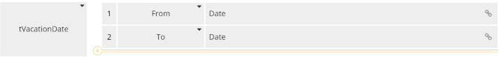
To refer to the data type itself in an expression, use the question mark "?".
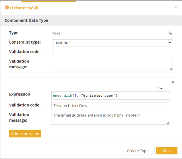
Siblings (same level) of a data type can be referred in an expression using its name.
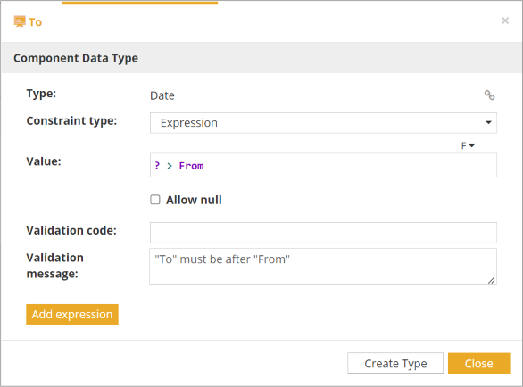
Changing the constraint type to "None" will remove the main constraint. If there are additional expression constraints, the first one will be set as the main one.
Adding collection constraints
When a type is a collection, collection constraints can be defined by clicking at the icon in the namecell. The constraint will apply on the collection itself.
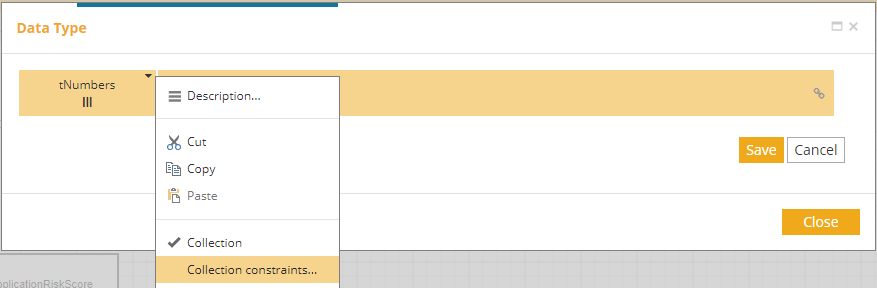
The following type of constraints are available
Size |
Number of elements of the collection. |
Expression |
A FEEL expression that defines the constraint on the collection. |
Not null |
The collection can never be set to null. |
Optionals validation code and validation message can also be entered for each constraint. It allows to show a custom error message when the constraint is not respected.
Clicking the "Add Constraint" button allows to enter an additional constraint that must be met along with the main one. The constraint could be Expression, Size or Not null ( Size and Not null are limited to one of each for a collection constraint). To delete it, click on the at the top right.
To refer to the collection itself in an expression, use the question mark "?".
Adding custom rendering
When a type is defined, custom rendering can be defined by clicking at the icon in the namecell and clicking on "Display…" option.
The rendering will apply on the type itself when displayed in a form.
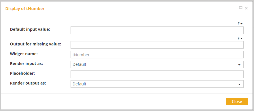
The following options of custom rendering are available
| Type | Attribute | Option |
|---|---|---|
All |
Default input value |
FEEL expression
When default input value is set, instead of being set to null, input value will be set to the default one. If an enumeration is also set and default input value is listed, it will be filtered out in the enumeration and displayed as the default input value instead. |
Output for missing value |
FEEL expression
Output for missing value is value displayed if value is set to null. |
|
Widget name |
Text Allows user to target an input or an output based on this attribute to overload data rendering with user own widgets, instead of targeting it by data type name. |
| FEEL expression is evaluated when rendering a form. |
| Type | Attribute | Option |
|---|---|---|
Boolean |
True label |
Replace true value by a more meaningful single word or phrase
|
False label |
Replace false value by a more meaningful single word or phrase
|
|
Render input as |
Select
Radio buttons
Checkboxes Buttons Switch |
|
Render output as |
Text
Radio buttons
Checkboxes
Buttons
Switch |
| True label and false label are strings displayed in form. Value is still a boolean. |
| Type | Attribute | Option | Requirement |
|---|---|---|---|
Date |
Input date pattern |
Supported patterns are a combination of year representation (yyyy, YYYY, aaaa, AAAA), month representation (mm, MM) and day representation (dd, DD, jj, JJ) separated by either a '-' or a '/'. |
|
Render input as |
Select
Buttons |
Enumeration Enumeration |
|
Output date format |
Full
Long
Medium
Short
|
||
Date and time |
Render input with |
Local time zone Time zone picker Time offset picker Fixed time zone Fixed time offset No time zone picker |
|
Render input as |
Select
Buttons |
Enumeration Enumeration |
|
Input date pattern |
Supported patterns are a combination of year representation (yyyy, YYYY, aaaa, AAAA), month representation (mm, MM) and day representation (dd, DD, jj, JJ) separated by either a '-' or a '/'. |
||
Output date format |
Full
Long
Medium
Short
|
||
Output time format |
Full
Long
Medium
Short
|
||
12-hour time |
Allows output to display time with or without AM/PM.
|
||
Time |
Render input with |
Local time zone Time zone picker Time offset picker Fixed time zone Fixed time offset No time zone picker |
|
Render input as |
Select
Buttons |
Enumeration Enumeration |
|
Output time format |
Full
Long
Medium
Short
|
||
12-hour time |
Allows output to display time with or without AM/PM.
|
| Display of date, date and time and time can differ based on browser and user settings. |
| Type | Attribute | Option | Requirement |
|---|---|---|---|
Number |
Prefix |
Allows to display a prefix before input or output |
|
Suffix |
Allows to display a suffix after input or output |
||
Placeholder |
Informational text |
||
Render input as |
Select
Buttons |
Enumeration Enumeration |
|
Render output as |
Display mask
Percentage (Multiply the value by 100 and add a
Currency
|
Display mask
Currency |
|
Display mask |
A mask is defined using the ECMA-376 specification that is used in spreadsheets (such as Microsoft Excel) to display numbers. |
||
Currency |
The currency code (three uppercase letters) of the currency according to the ISO 4217 standard. |
||
Output scale |
Set a number as a floating point number with n decimals
|
|
| Colors in the display mask are supported only for the forms. |
| Type | Attribute | Option | Requirement |
|---|---|---|---|
Text |
Render input as |
Text
Textarea
Select
Autocomplete Buttons Password Phone number URL |
Enumeration Enumeration Enumeration |
Textarea rows |
Number of rows to display for a text area |
Positive number |
|
Textarea columns |
Number of columns to display for a text area |
Positive number |
|
Placeholder |
Informational text |
||
Render output as |
Text
Preformatted text
HTML
Password
URL
|
URL caption |
|
URL caption |
Text displayed instead of URL. If not provided, URL is displayed by default
|
|
Requirement is mandatory. Requirement is not mandatory. |